When I first started writing React, I remember seeing many different approaches to writing components, varying greatly from tutorial to tutorial. Though the framework has matured considerably since then, there doesn’t seem to yet be a firm ‘right’ way of doing things.
Over the past year at MuseFind, our team has written a lot of React components. We’ve gradually refined our approach until we’re happy with it.
This guide represents our suggested best practices. We hope it will be useful, whether you’re a beginner or experienced.
Before we get started, a couple of notes:
- We use ES6 and ES7 syntax.
- If you’re not sure of the distinction between presentational and container components, we recommend you read this first.
- Please let us know in the comments if you have any suggestions, questions, or feedback.
Class Based Components
Class based components are stateful and/or contain methods. We try to use them as sparingly as possible, but they have their place.
Let’s incrementally build our component, line by line.
Importing CSS
import React, { Component } from 'react'
import { observer } from 'mobx-react'

import ExpandableForm from './ExpandableForm'
import './styles/ProfileContainer.css'
I like CSS in JavaScript, I do — in theory. But it’s still a new idea, and a mature solution hasn’t emerged. Until then, we import a CSS file to each component.
We also separate our dependency imports from local imports by a newline.
Initializing State
import React, { Component } from 'react'
import { observer } from 'mobx-react'

import ExpandableForm from './ExpandableForm'
import './styles/ProfileContainer.css'

export default class ProfileContainer extends Component {
state = { expanded: false }
You can also use the older approach of initializing state in the constructor. More on that here. We prefer the cleaner way.
We also make sure to export our class as the default.
propTypes and defaultProps
import React, { Component } from 'react'
import { observer } from 'mobx-react'
import { string, object } from 'prop-types'

import ExpandableForm from './ExpandableForm'
import './styles/ProfileContainer.css'

export default class ProfileContainer extends Component {
state = { expanded: false }

  static propTypes = {
    model: object.isRequired,
    title: string
  }

  static defaultProps = {
    model: {
      id: 0
    },
    title: 'Your Name'
  }
propTypes and defaultProps are static properties, declared as high as possible within the component code. They should be immediately visible to other devs reading the file, since they serve as documentation.
If using React 15.3.0 or higher, use the prop-types package instead of React.PropTypes — nicely destructured, of course.
All your components should have propTypes.
Methods
import React, { Component } from 'react'
import { observer } from 'mobx-react'
import { string, object } from 'prop-types'

import ExpandableForm from './ExpandableForm'
import './styles/ProfileContainer.css'

export default class ProfileContainer extends Component {
  state = { expanded: false }

  static propTypes = {
    model: object.isRequired,
    title: string
  }

  static defaultProps = {
    model: {
      id: 0
    },
    title: 'Your Name'
  }
  handleSubmit = (e) => {
    e.preventDefault()
    this.props.model.save()
  }

  handleNameChange = (e) => {
    this.props.model.changeName(e.target.value)
  }

  handleExpand = (e) => {
    e.preventDefault()
    this.setState({ expanded: !this.state.expanded })
  }
With class components, when you pass methods to subcomponents, you have to ensure that they have the right this when they’re called. This is usually achieved by passing this.handleSubmit.bind(this) to the subcomponent.
We think this approach is cleaner and easier, maintaining the correct context automatically via the ES6 arrow function.
Passing setState a Function
In the above example, we do this
this.setState({ expanded: !this.state.expanded })Here’s the dirty secret about setState — it’s actually asynchronous. React batches state changes for performance reasons, so the state may not change immediately after setState is called.
That means you should not rely on the current state when calling setState — since you can’t be sure what that state will be!
Here’s the solution — pass a function to setState, with the previous state as an argument.
this.setState(prevState => ({ expanded: !prevState.expanded }))(Thanks to Austin Wood for his help with this section).
Destructuring Props
import React, { Component } from 'react'
import { observer } from 'mobx-react'
import { string, object } from 'prop-types'
import ExpandableForm from './ExpandableForm'
import './styles/ProfileContainer.css'
export default class ProfileContainer extends Component {
  state = { expanded: false }

  static propTypes = {
    model: object.isRequired,
    title: string
  }

  static defaultProps = {
    model: {
      id: 0
    },
    title: 'Your Name'
  }
handleSubmit = (e) => {
    e.preventDefault()
    this.props.model.save()
  }

  handleNameChange = (e) => {
    this.props.model.changeName(e.target.value)
  }

  handleExpand = (e) => {
    e.preventDefault()
    this.setState(prevState => ({ expanded: !prevState.expanded }))
  }

  render() {
    const {
      model,
      title
    } = this.props
    return (
      <ExpandableForm
        onSubmit={this.handleSubmit}
        expanded={this.state.expanded}
        onExpand={this.handleExpand}>
        <div>
          <h1>{title}</h1>
          <input
            type="text"
            value={model.name}
            onChange={this.handleNameChange}
            placeholder="Your Name"/>
        </div>
      </ExpandableForm>
    )
  }
}
Components with many props should have each prop on a newline, like above.
Decorators
@observer
export default class ProfileContainer extends Component {
If you’re using something like mobx, you can decorate your class components like so — which is the same as passing the component into a function.
Decorators are flexible and readable way of modifying component functionality. We use them extensively, with mobx and our own mobx-models library.
If you don’t want to use decorators, do the following:
class ProfileContainer extends Component {
  // Component code
}
export default observer(ProfileContainer)
Closures
Avoid passing new closures to subcomponents, like so:
<input
            type="text"
            value={model.name}
            // onChange={(e) => { model.name = e.target.value }}
            // ^ Not this. Use the below:
            onChange={this.handleChange}
            placeholder="Your Name"/>
Here’s why: every time the parent component renders, a new function is created and passed to the input.
If the input were a React component, this would automatically trigger it to re-render, regardless of whether its other props have actually changed.
Reconciliation is the most expensive part of React. Don’t make it harder than it needs to be! Plus, passing a class method is easier to read, debug, and change.
Here’s our full component:
Functional Components
These components have no state and no methods. They’re pure, and easy to reason about. Use them as often as possible.
propTypes
import React from 'react'
import { observer } from 'mobx-react'
import { func, bool } from 'prop-types'
import './styles/Form.css'
ExpandableForm.propTypes = {
  onSubmit: func.isRequired,
  expanded: bool
}
// Component declaration
Here, we assign the propTypes before the component declaration, so they are immediately visible. We’re able to do this because of JavaScript function hoisting.
Destructuring Props and defaultProps
import React from 'react'
import { observer } from 'mobx-react'
import { func, bool } from 'prop-types'
import './styles/Form.css'
ExpandableForm.propTypes = {
  onSubmit: func.isRequired,
  expanded: bool,
  onExpand: func.isRequired
}
function ExpandableForm(props) {
  const formStyle = props.expanded ? {height: 'auto'} : {height: 0}
  return (
    <form style={formStyle} onSubmit={props.onSubmit}>
      {props.children}
      <button onClick={props.onExpand}>Expand</button>
    </form>
  )
}
Our component is a function, which takes its props as its argument. We can expand them like so:
import React from 'react'
import { observer } from 'mobx-react'
import { func, bool } from 'prop-types'
import './styles/Form.css'
ExpandableForm.propTypes = {
  onSubmit: func.isRequired,
  expanded: bool,
  onExpand: func.isRequired
}
function ExpandableForm({ onExpand, expanded = false, children, onSubmit }) {
  const formStyle = expanded ? {height: 'auto'} : {height: 0}
  return (
    <form style={formStyle} onSubmit={onSubmit}>
      {children}
      <button onClick={onExpand}>Expand</button>
    </form>
  )
}
Note we can also use default arguments to act as defaultProps in a highly readable manner. If expanded is undefined, we set it to false. (A bit of a forced example, since it’s a boolean, but very useful for avoiding ‘Cannot read <property> of undefined’ errors with objects).
Avoid the following ES6 syntax:
const ExpandableForm = ({ onExpand, expanded, children }) => {Looks very modern, but the function here is actually unnamed.
This lack of name will not be a problem if your Babel is set up correctly — but if it’s not, any errors will show up as occurring in <<anonymous>> which is terrible for debugging.
Unnamed functions can also cause problems with Jest, a React testing library. Due to the potential for difficult-to-understand bugs (and the lack of real benefit) we recommend using function instead of const.
Wrapping
Since you can’t use decorators with functional components, you simply pass it the function in as an argument:
import React from 'react'
import { observer } from 'mobx-react'
import { func, bool } from 'prop-types'
import './styles/Form.css'
ExpandableForm.propTypes = {
  onSubmit: func.isRequired,
  expanded: bool,
  onExpand: func.isRequired
}
function ExpandableForm({ onExpand, expanded = false, children, onSubmit }) {
  const formStyle = expanded ? {height: 'auto'} : {height: 0}
  return (
    <form style={formStyle} onSubmit={onSubmit}>
      {children}
      <button onClick={onExpand}>Expand</button>
    </form>
  )
}
export default observer(ExpandableForm)
Here’s our full component:
Conditionals in JSX
Chances are you’re going to do a lot of conditional rendering. Here’s what you want to avoid:

No, nested ternaries are not a good idea.
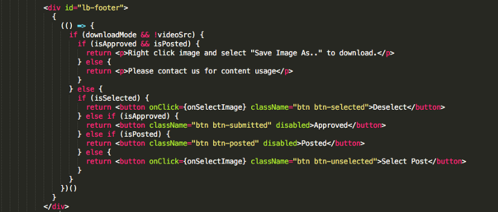
There are some libraries that solve this problem (JSX-Control Statements), but rather than introduce another dependency, we settled on this approach for complex conditions:

Use curly braces wrapping an IIFE, and then put your if statements inside, returning whatever you want to render. Note that IIFE’s like this can cause a performance hit, but in most cases it will not be significant enough to warrant losing the readability factor.
Update: Many commenters have recommended extracting this logic to a subcomponent that conditionally returns different buttons based on props. They’re right — splitting up your components as much as possible is always a good call. But keep the IIFE approach in mind as a fallback for quick conditionals.
Also, when you only want to render an element on one condition, instead of doing this…
{
  isTrue
   ? <p>True!</p>
   : <none/>
}
… use short-circuit evaluation:
{
  isTrue &&
    <p>True!</p>
}
Conclusion
Was this article useful? Please click the green heart below, or follow me and our publication for more.
Have any feedback? Leave a comment below.
Thanks for reading!


